Saturday, December 19, 2009

New 'Directions' in Abstract Art for grade four class...


Another visit at Agnes Davidson school in Lethbridge; this time with an extremely talented group of grade four students. As you can see, they are truly budding Artists. After seeing the "Directions" exhibit and talking about Colour, Line, Shape and many other Elements of Art & Principles of Design... the students were eager to create their own abstractions!

Friday, December 18, 2009

Agnes Davidson Grade One Class Dec, 2009


I visited a grade one class at Agnes Davidson school. We talked about abstractions, colour theory and artists in history that related to the "Directions" exhibit. Then we viewed the "Directions" exhibit and came back to the classroom and the kids created wonderful, vibrant Artworks using coloured construction paper. Even their teacher made one (bottom left)! It has been a great experience thus far as a visiting artist with the AFA TREX program.


Wednesday, December 9, 2009

Digital Playground


This is my most recent abstraction. It came together quite quickly... when viewed without my glasses on I enjoy it even more, as the colours fuze together into 'beautiful fuzziness'.

Agnes Davidson Grade Fives take to Abstraction...


This morning I was at Agnes Davidson school in Lethbridge, in Louise Cormier's grade five class. The students and I discussed colour theory and then they created vibrant abstractions within the grid structure created through the 'drip-drive' process. The primary mediums were felt marker and chalk pastel on paper. The students seemed to enjoy themselves as they made quite amazing colourful compositions! I will be doing creative projects with the students of Agnes Davidson over the next couple of weeks.

Thursday, December 3, 2009

'DIRECTIONS' Alberta Bound...


The Alberta Foundation for the Arts Travelling Exhibition (TREX) program has optioned to take my "Directions" Art work for a two-year tour of Alberta. It is their mandate to have exposure in the Arts to the perifery of the established art scene; the display will go to many small venues such as schools and libraries primarily in rural Alberta. I count myself fortunate to be a part of this program. The first stop of the tour is at Agnes Davidson school in Lethbridge. I am pictured here with two of the paintings from the series in the background at Agnes Davidson School.

Louise & Deborah... teacher friends & mentors


The 'Directions' exhibit lies beneath in the crates... at its first destination of a two-year Alberta Foundation for the Arts tour of Alberta with the TREX program, here shown at Agnes Davidson school in Lethbridge with two friends/colleagues of mine. We enjoyed hanging the show, and I will be visiting Louise's (L) grade five class discussing the exhibit and doing a related art activity with them. I'm looking forward to next week!

Friday, November 20, 2009

Camouflage


My most recent painting to date (Nov.2oth, 2009). The subtlety it has in colour gradation is not something I always do, but working with a limited palette has its optical advantages!

Formation


This is a piece that began with radiating shapes from the center outward. No shape is certain but it does reference birds, butterflies, bats or bees (okay enough with the alliteration!) My dad did an Artwork years ago with butterflies in a similar formation... although his work is a lot more 'literal' than this abstraction presents. My dad has always been an inspiration to me artistically.

Peering Through


A recent work... It was made in the opposite method of building up shape... rather than a linear beginning it was started with small flecks and simple shapes of an intensely dark hue. What I like most is the depth created within.

Rough edges

This is a piece from a number of years back... I love the texture and loose quality it has.

mid way

An abstraction I was working on earlier this year... In the end it looked nothing like this (which I preferred... guess I didn't know when to stop).

Tuesday, October 27, 2009

Merry Xmas To Trap\Door, One and All...

This is a little Box called "The Way I Roll" which I made for the Trap\Door Artist Run Centre member show, '1000 CCs' (max dimensions 10cm x 10cm x 10cm) at the Bowman Arts Centre, Lethbridge, AB in 2009. I donated it for their annual Xmas Wishbook Online Fundraiser.

Wednesday, May 13, 2009

Wednesday, May 6, 2009

RESONATE ('09) - acrylic 3 x 4 ft.


This is my most recent work as of the end of April '09... I plan to submit it for jurying to the "Drawing on the Imagination" exhibit with the Bowman Arts Centre this summer.

BLUE HUES (with a kick) - detail


BLUE HUES (with a kick) - 2009


Add Image
This is one of three submissions I sent to the 2009 RBC painting competition. (fingers crossed!)

CONTINUITY ('09)


Monday, March 30, 2009

New Work 2009


These are some small works from a new series I'm working on... playing around with color, organic lines and positive/negative space...

New Work 2009


These are some small works from a new series I'm working on... playing around with color, organic lines and positive/negative space...

Tuesday, March 10, 2009

New Work (2009)


This was a new approach for me to abstraction... it's a distant variation of other techniques I have tried in past years. This picture is at the opening reception of 'Teamworks' in the Lethbridge Centre mall, in February '09.

This painting has interesting qualities when viewed through RED/BLUE 3D glasses... optical FUN...

Enjoy!

Tuesday, February 24, 2009

Critical Review

Directions

The ‘drip-drive’ series by Aaron Hagan isn’t just an exuberant celebration of colour, but a rigorous examination of the process of painting itself.

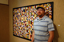
The exhibition “Directions”, at the Bowman Arts Centre, presents 18 works from Hagan’s ‘drip-drive’ series. The pieces in the exhibition have been executed within the past 14 months, although Hagan has been working on the series for a number of years.

The visitor to the gallery is immediately struck by the almost overwhelming power of the colors in the pictures, bordering on overload. In the initial seconds, with the paintings encompassing your entire field of vision, a sensitive person may feel they are succumbing to the initial paroxysms of Stendhals Syndrome, but the moment quickly passes. The veiwer is left with the opportunity to reflect on the individual works, and interact personally with the pieces.

The drip-drive paintings are constructed by dripping paint from the four edges to create a grid. This grid is then obsessively filled with small swatches of colour. It is an arbitrary process for Hagan, as he responds organically to the slowly coalescing field of color on the canvas. Sometimes he explores the tensions between complementary colors, the unity of monochromatics or the push and pull of warm and cool colours. Decisions about the direction of the paintings are made as the work progresses. The end result is always a sparkling jewel-like surface.

The exhibition “Directions” is accessible and interesting to everyone, from the seasoned art veteran to the individual with no previous exposure to art. They are interesting as an investigation of seriality, where the grid motif becomes a matrix to explore an endless possibility of colour relationships, they are interesting as questions about the compulsive, labour intensive process of art-making itself, and they are interesting as a celebration of the seductive and sensory power of colour.

The exhibition runs until March 7. The Alberta Foundation for the Arts Traveling Exhibition Program has optioned to take the show on the road, and it will be touring the province in the coming year. If you haven’t seen the exhibition, find the time, it is worth it.

Thursday, February 19, 2009

Lil' ol' me with 'Of All the Colors in the World' behind...


Flitter

This piece caught inspiration from the painter Gustav Klimt, who created loose patterns with many color swatches and used a lot of gold paint in his work.

Flitter (Close-up)


The Apple Dumpling Gang (Close-up)


Flying Over Zootown


Hidden within this painting is a plethora of mammals... can you spot the purple terrier, the green giraffe and the whale?

Kaleidoscope

This is the one from the series I refer to as my 'superman' painting... at least it started out that way, over the top... I subdued it quite a bit as it got closer and closer to being completed.

70s Suite


Look at the colors... what more can I say?

Veil


This is one of the last pieces I finished for the "Directions" show. I experimented a lot with layering to create a hightened sense of depth.

Of All the Colors in the World


As paint drips quite different on a strong canvas tooth as opposed to board, the result is a much more organic patterning effect. I wanted to use a more subtle tonal shift in this painting so I used a lot more pastel-based hues. This painting is the largest of the drip-drive series, measuring over 4 x 5 ft.

Connect

This is the earliest large-scale Drip-Drive from 2007... It measures 44" x 67" and was both a lot of fun and work to complete. I went a bit 'outside the box' to create some of the a-symmetrical shapes within. Thanks to my studio mate Troy Nickle (at the time) who supplied me with the surface, which he found in a back alley.

The Apple Dumpling Gang

Had fun naming this one... a throwback to my childhood... the old Disney Tim Conway and Don Knotts comedy. If one looks hard enough they might find a Don Knotts profile... well, maybe not.


Mosaic


This is one of four of the color-study mini series. Although I've incorporated a variety of hues, the yellow-orange prevails to be the stand-out hue. I enjoy how such variety can be included in a work of art, yet there remains a focal point or in this case, a prevailing hue.

Broken Water


Using a blue-green overall hue, I was still able to incorporate a variety of other colors. This is one of a four-part mini-series that illustrates color-relationships; there are strong contrasts, yet the blue-green hue dominates.

Bedtime Story Quilt


Another 'Drip-Drive' painting from 2008; this painting was intended to be representative of 'earth tones' while still incorporating non-local colors.

Chips Off the Color Block

This is a playful painting. It's one of the smaller works from the "Directions" exhibit. I wanted to somehow introduce many different colors but still have an overall feel of a red-purple hue. I think that was accomplished. It is part of a mini-series of four... addressing color-theory. The others are green-blue, yellow-orange and 'earth tones'.

Corridor


I initially wanted to make this a monochromatic painting (consistent variations of blue hues)... but, nearing completion, it seemed to need a little something to give it some 'punch'... so I proceeded to introduce other hues from the full spectrum. The painting become activated with the new hues. I called it 'Corridor' because the painting seems to direct your eyes along various paths or corridors, stopping on the swatches of color at times.

Grounded


This work is also from the "Directions" exhibit, on display at the Bowman Arts Centre until March 7th, 2009. With this particular painting I used the natural hue of the raw board as one of the 'earth tones'. Thus the masonite board is unsealed (no gesso).

Flitter

This painting was inspired by the work of Gustav Klimt, who used a lot of loose patterns and gold hues in his paintings. The shapes and colors seem to flicker around for me when looking at the painting.


Monday, February 9, 2009

Direction(s) Image 1

This is "Serend(r)ipity" A & B... a D(r)iptych... from the 'Drip-Drive' series, currently on display at the Bowman Arts Centre in Lethbridge, AB. This series has been worked on intermittently from 2005-08.